
Emily Kuhn Kitchen tour
Today we are excited to feature the kitchen of our social media manager, Emily. Emily and her husband Andrew recently bought a home knowing it needed a lot of work to make it a space they loved. With a limited budget and a little hard work, we were able to freshen up this space and take it from dark and dated to bright and cheery!
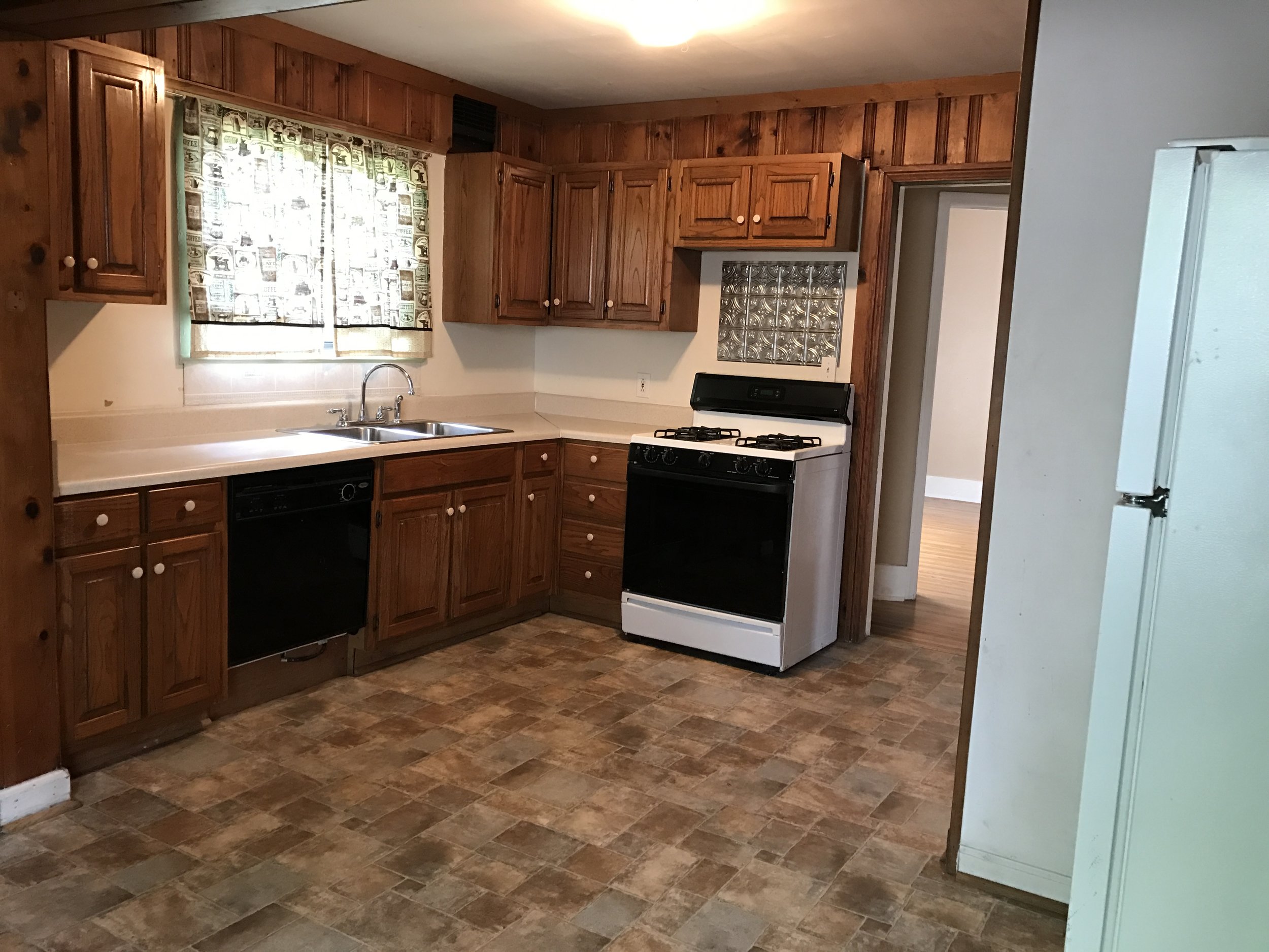
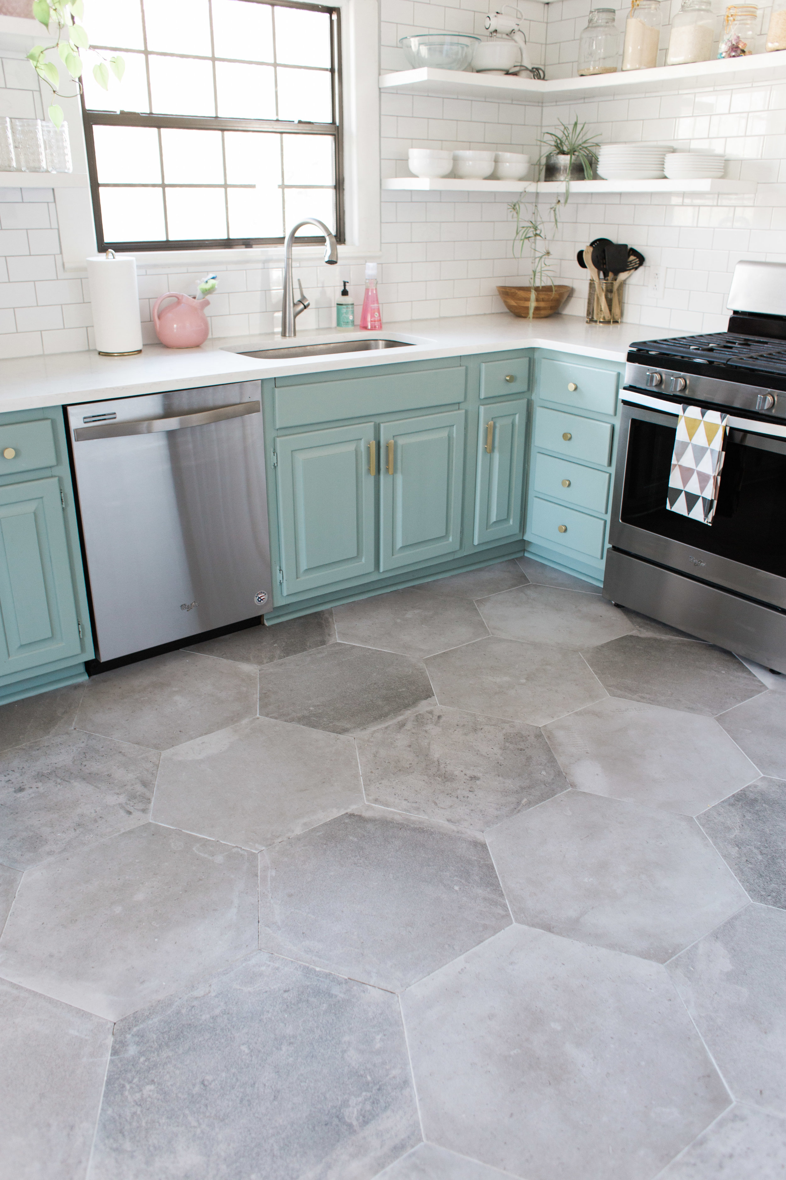
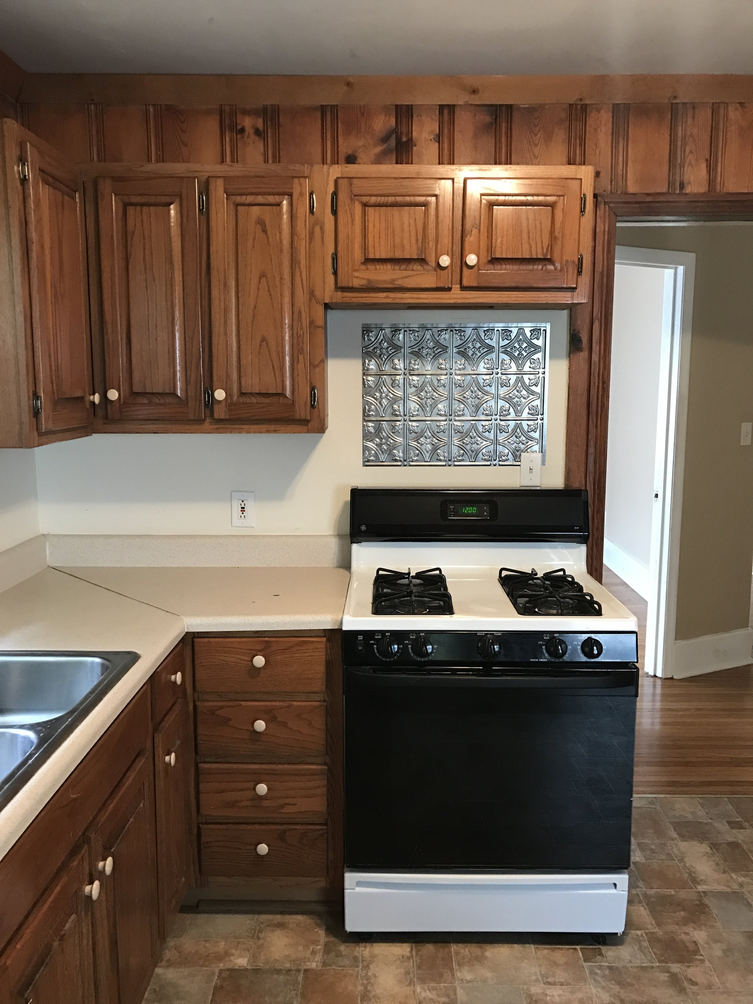
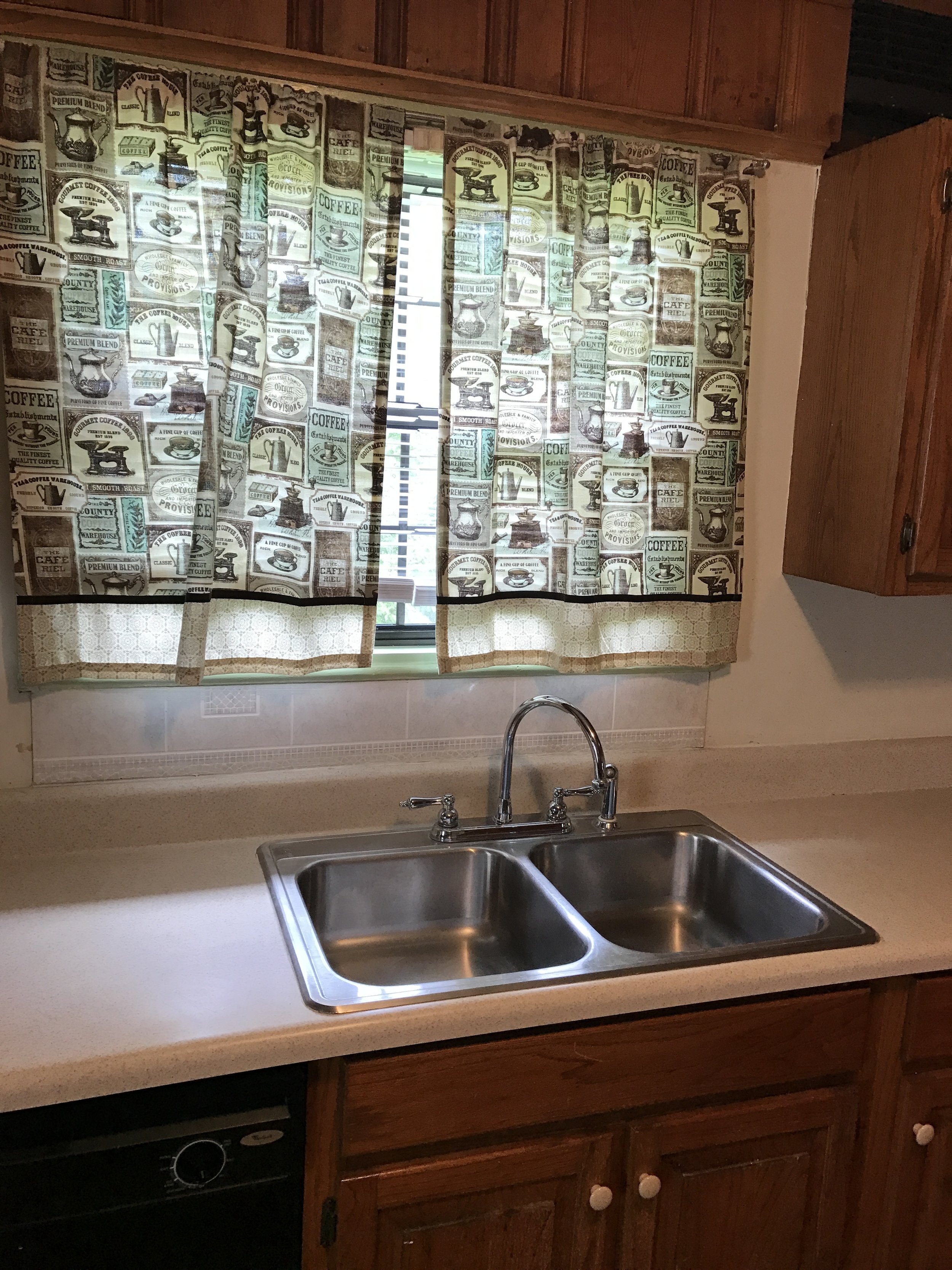
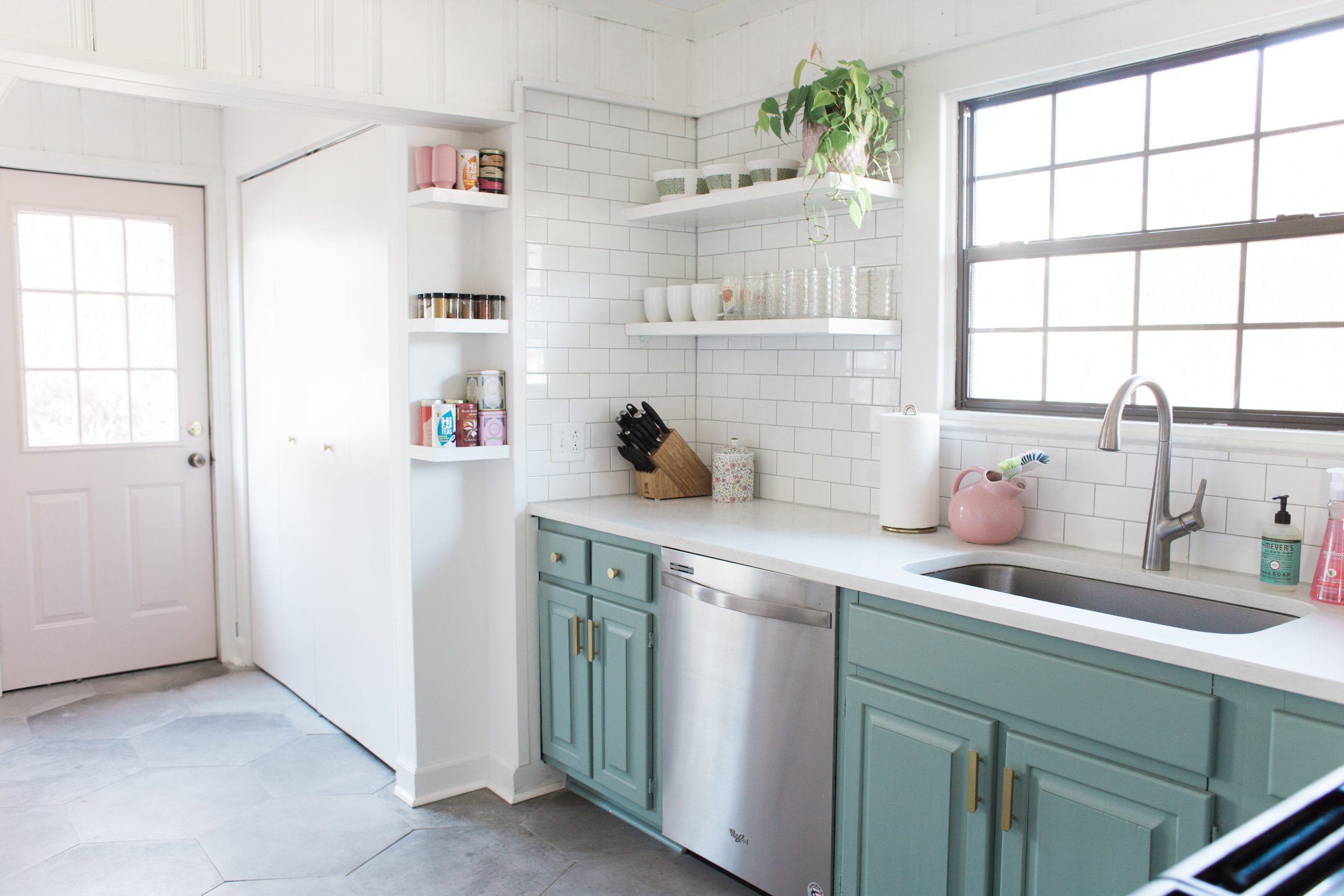
Before we started on this kitchen, the whole room was basically brown. Brown floors, brown cabinets, brown walls. The space felt small, dark, and definitely dated. We began by taking out the outdated floors, misfitting upper cabinets, and dingy counter tops. Due to their smaller budget, Emily and Andrew knew they needed to keep the existing footprint of the kitchen. By simply replacing the surfaces and adding fresh paint, they were able to make a big change while sticking to their limited budget. The biggest statement in this space is the unique floor tiles. These 20" grey hexagon tiles from Savoia Italia add tons of texture and visual interest to the small space while still feeling light and neutral.
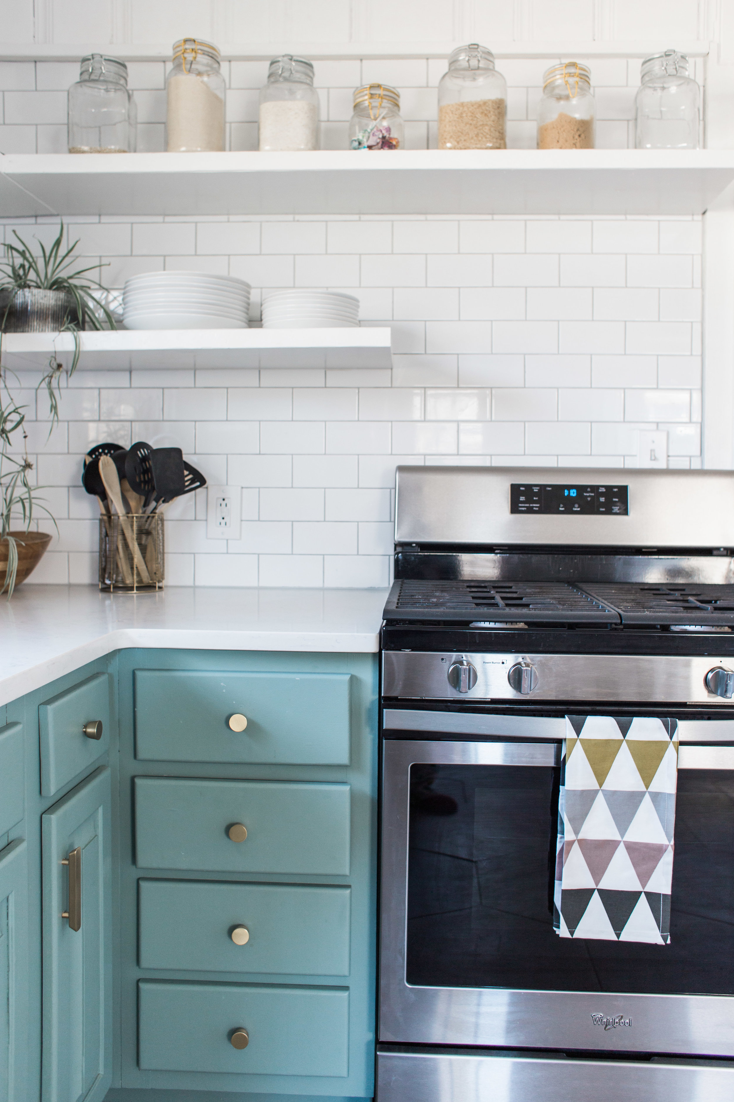
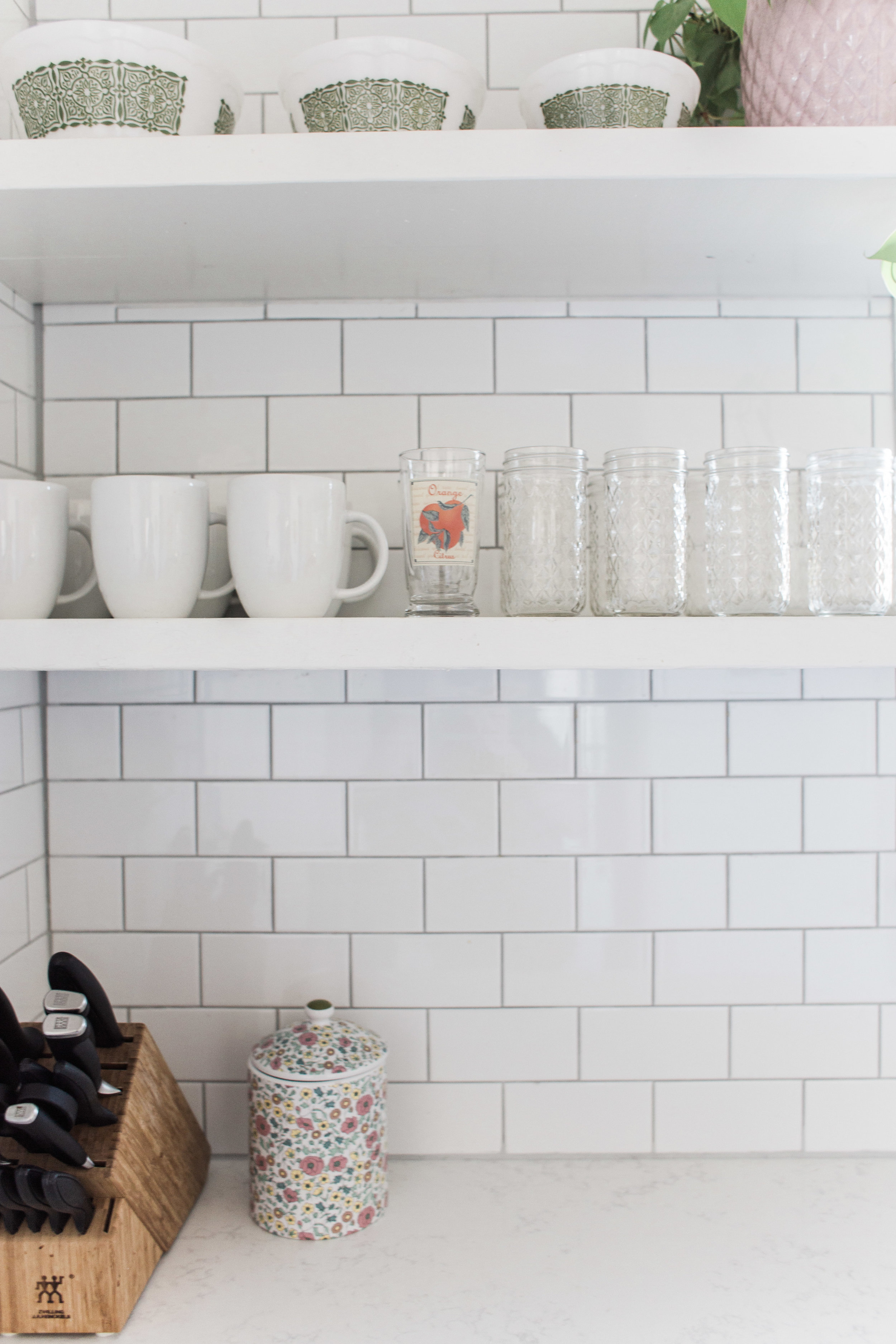
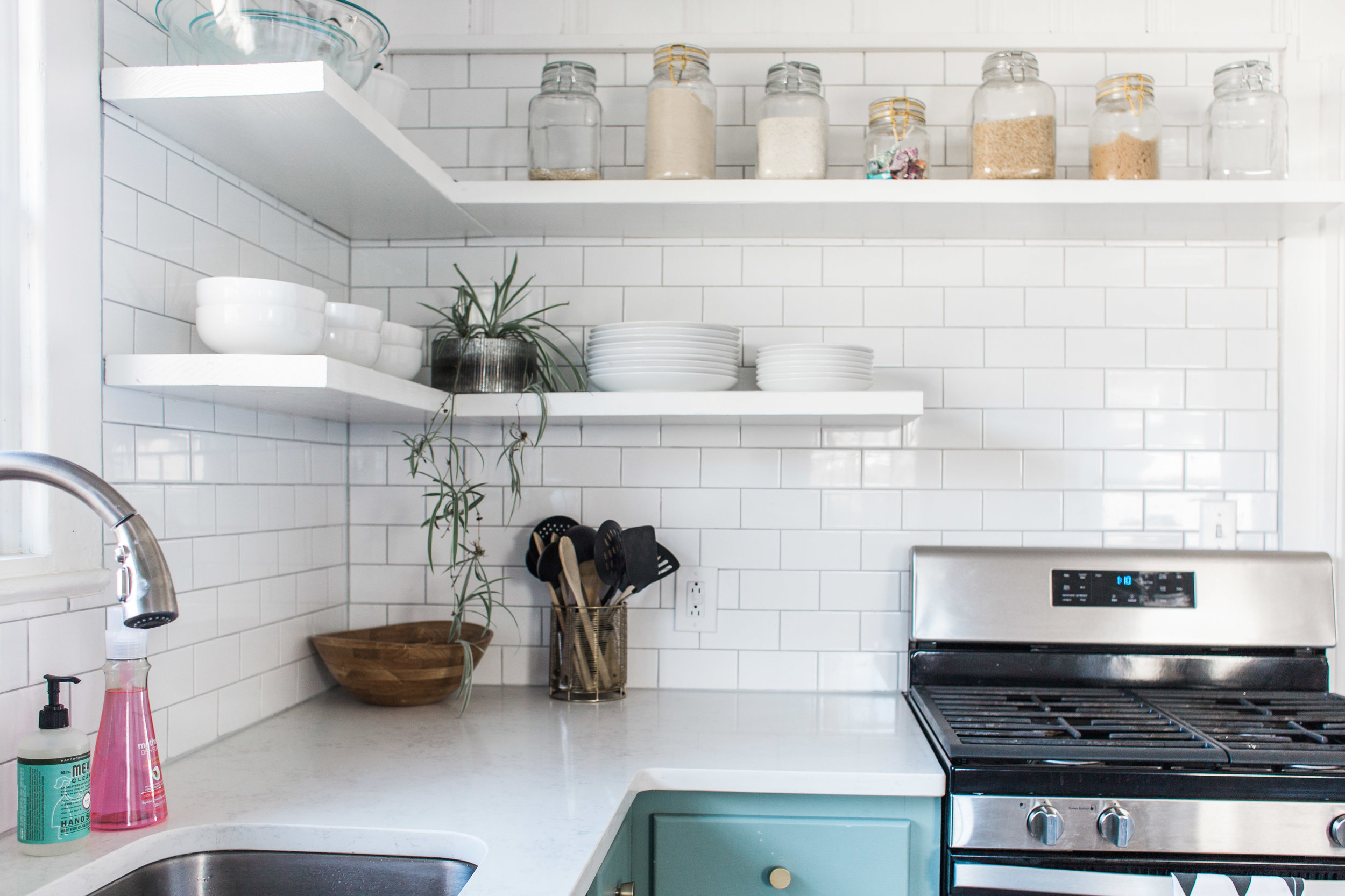
After removing the upper cabinets, Andrew and Emily knew they wanted to replace them with open shelving. Because the space is smaller, this was a great option to open up the space and make it feel a little larger. They chose to use glossy white subway tile behind the shelves to create a clean and cohesive look throughout the space.
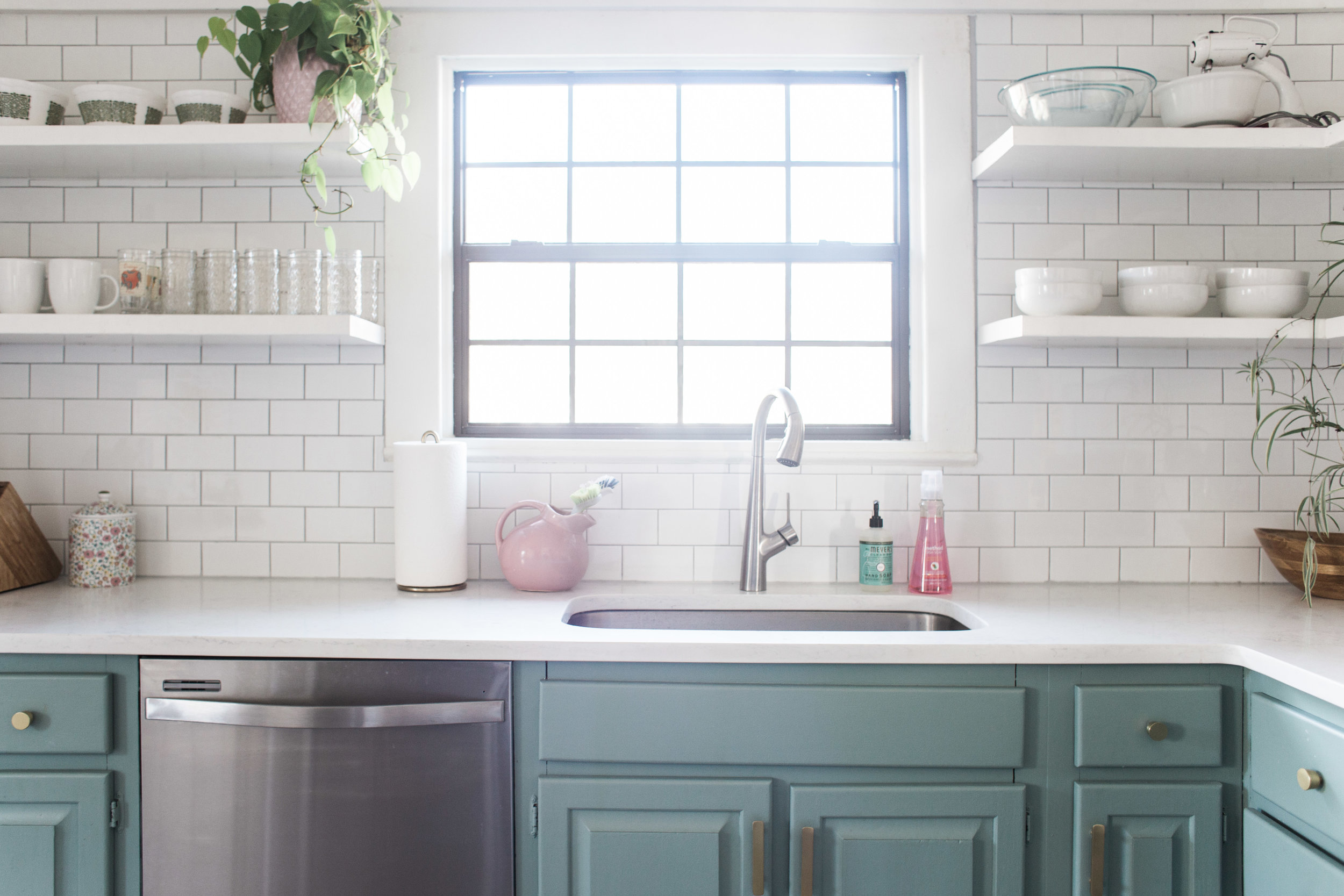
For the countertops, we chose a beautiful, bright, and durable Quartz surface called Calacatta Vincenza. Emily and Andrew love the look of marble, but wanted something that required less maintenance, so Quartz was a great option for them. We love how the grey veining in the countertops ties into the grey floors. Originally, Emily and Andrew had planned to paint the lower cabinets white, but after realizing how little cabinets were left, they decided to take a risk and paint them in a fun color. After trying many samples in similar shades, they decided on Benjamin Moore Azores AF-495. They love that it is playful, yet muted.
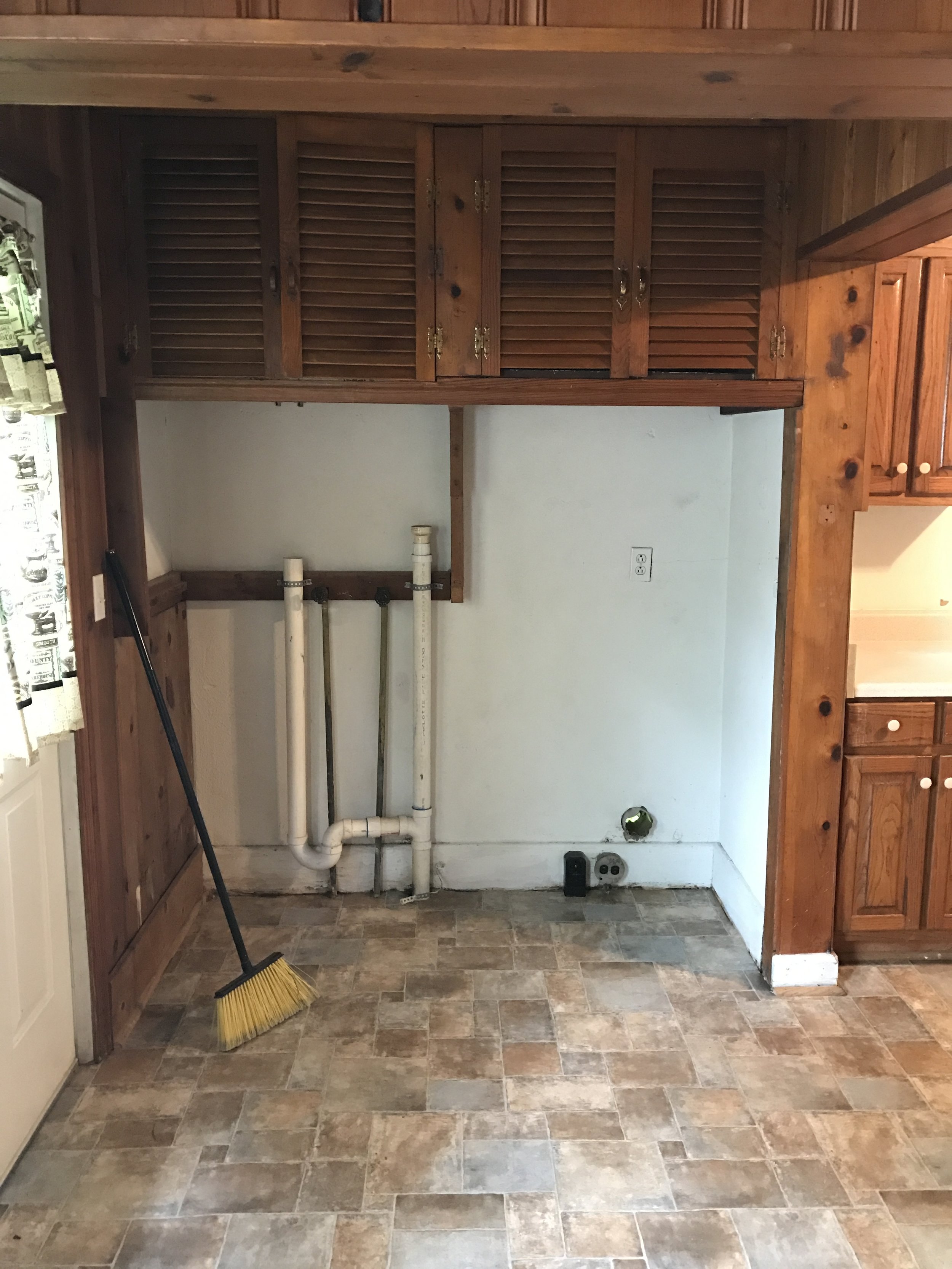
The biggest functional change in this kitchen was to close off the laundry area. By tearing out the existing laundry cabinets and creating a small closet around the laundry area, we were able to hide the washing machine and dryer and create a small pantry space.
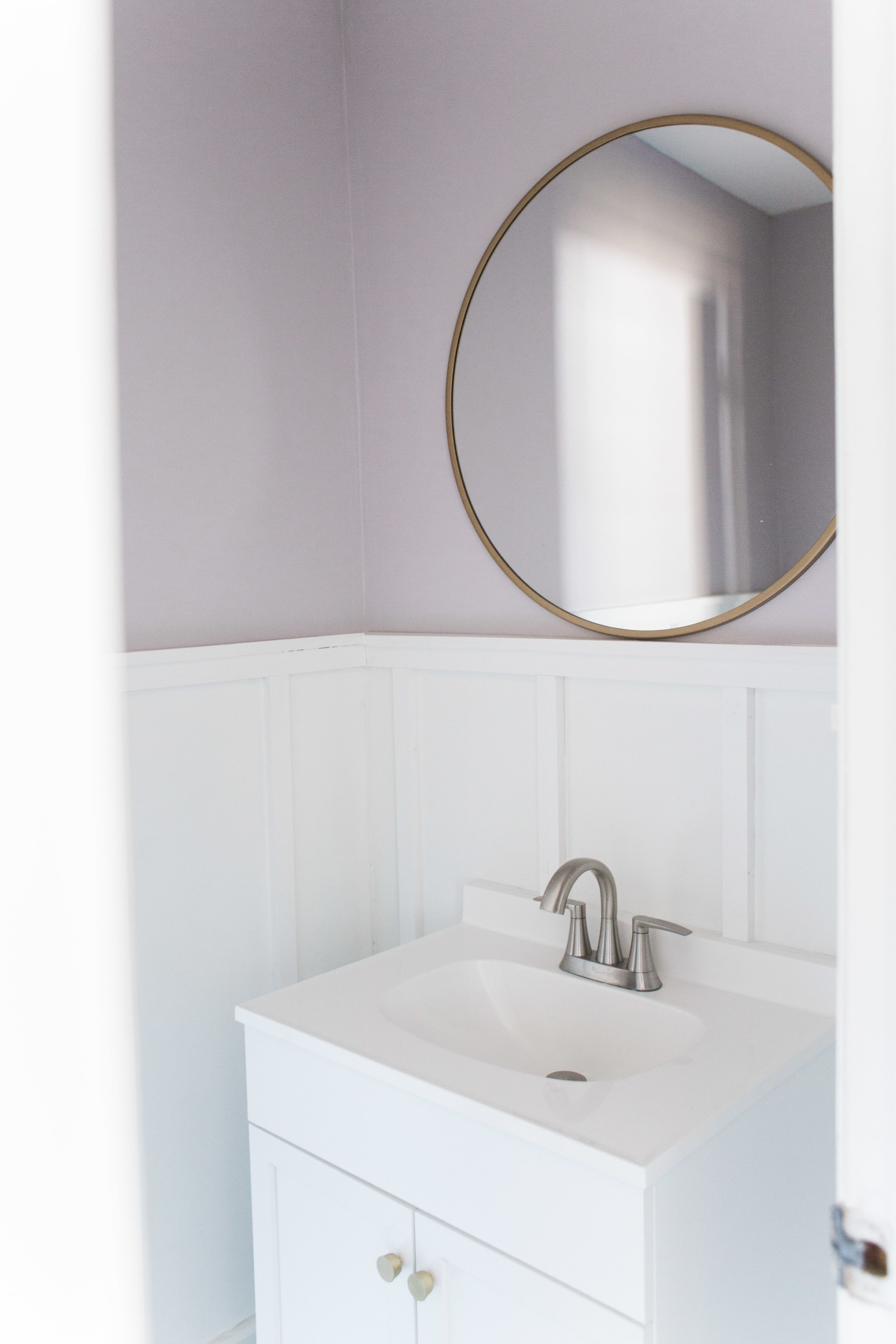
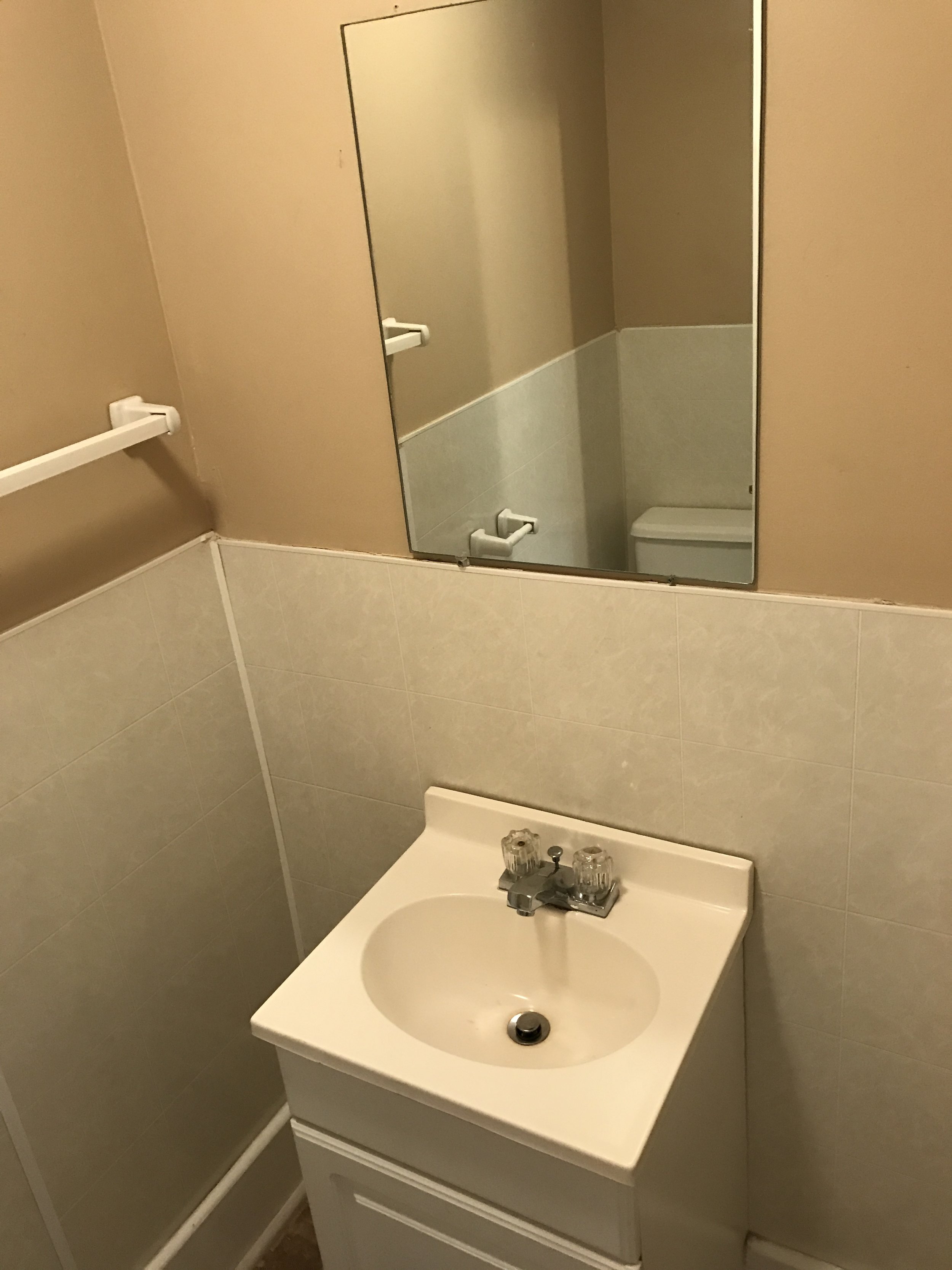
Off of the kitchen is a half-bath. When we saw this bathroom, we knew everything had to go. In addition to replacing the vanity and fixtures, we removed the faux wall tiles and added board and batten. This instantly elevated the space. Emily chose a pale lavender with grey undertones, Benjamin Moore Porcelain 2113-60, for the walls.
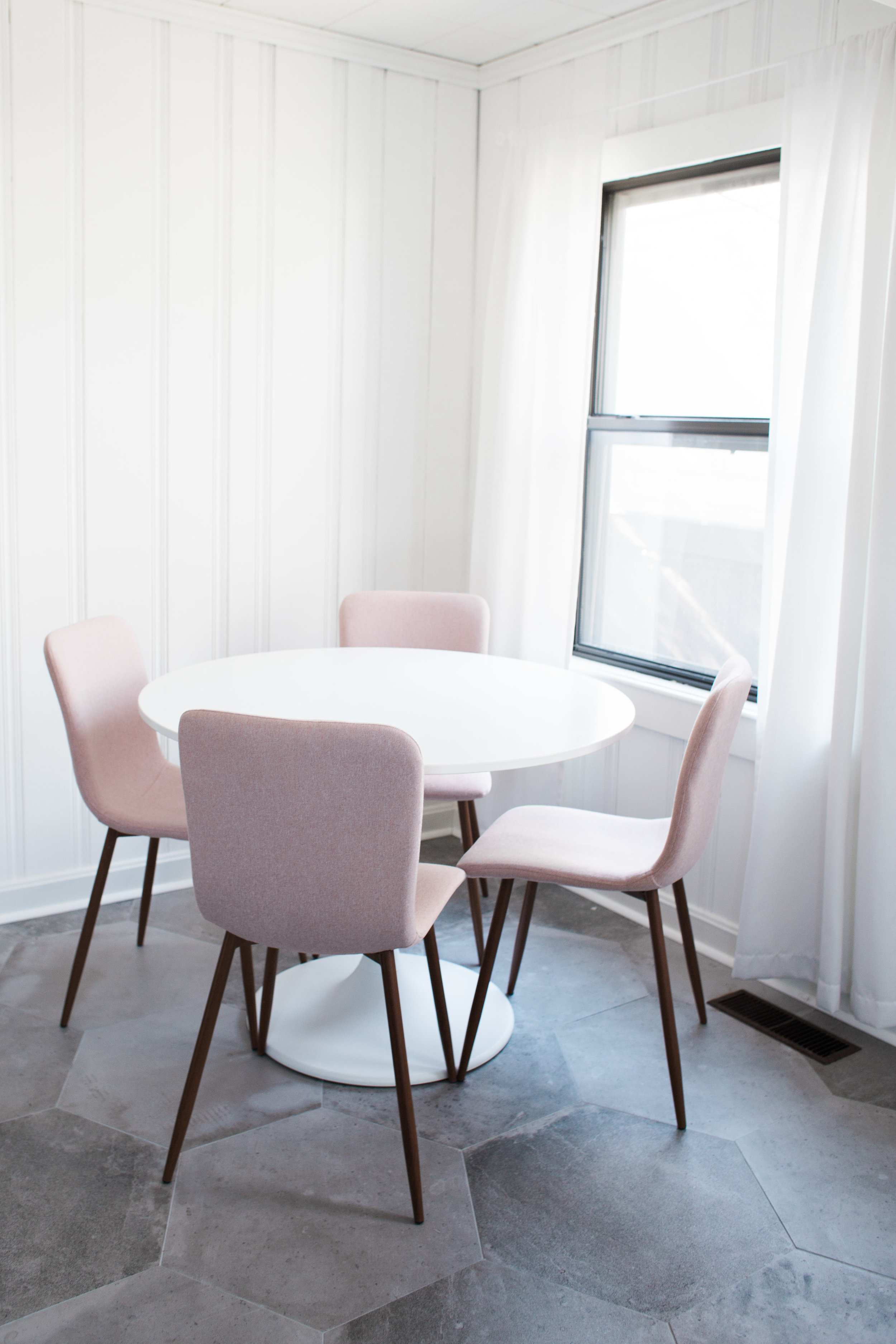
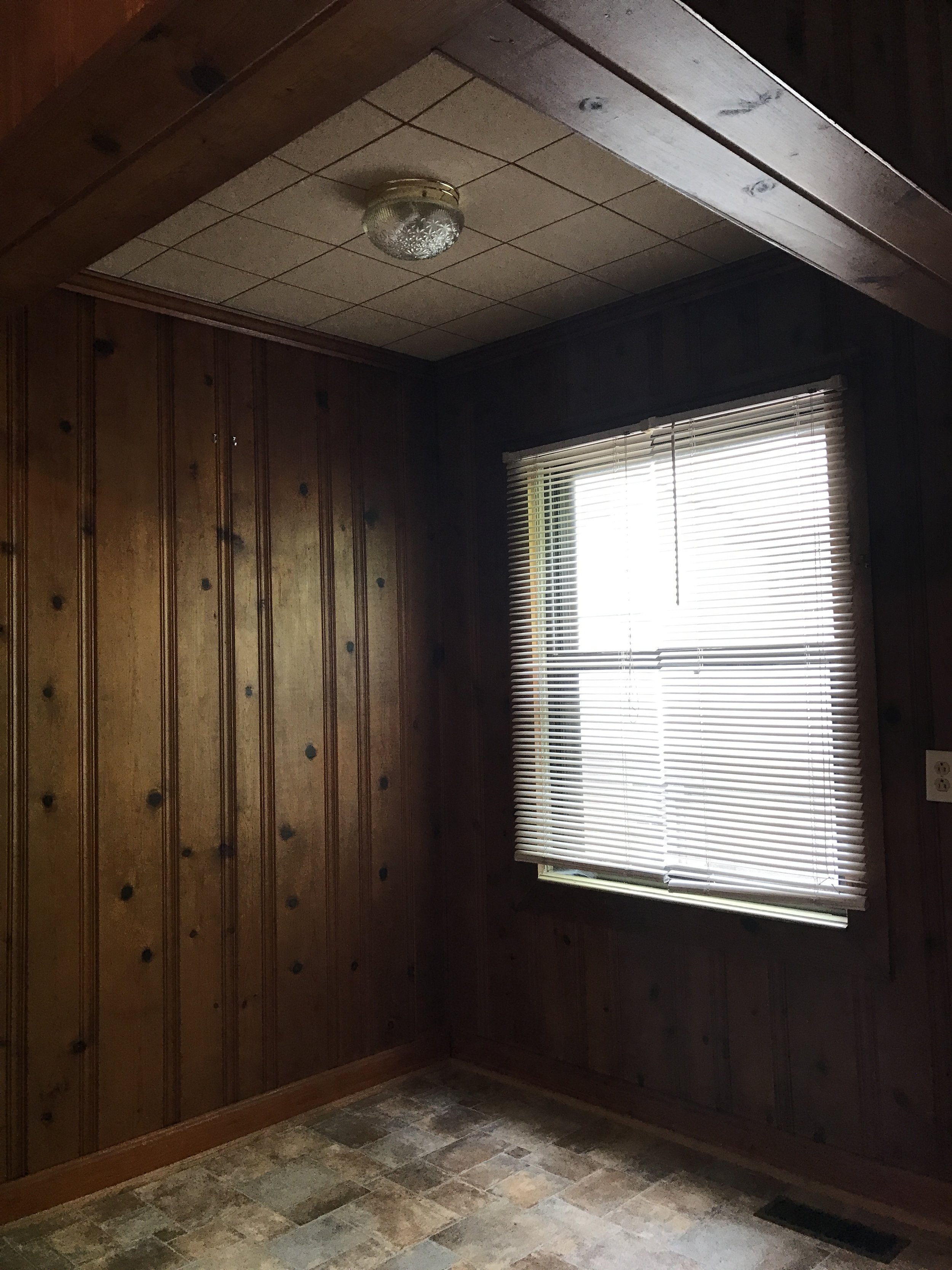
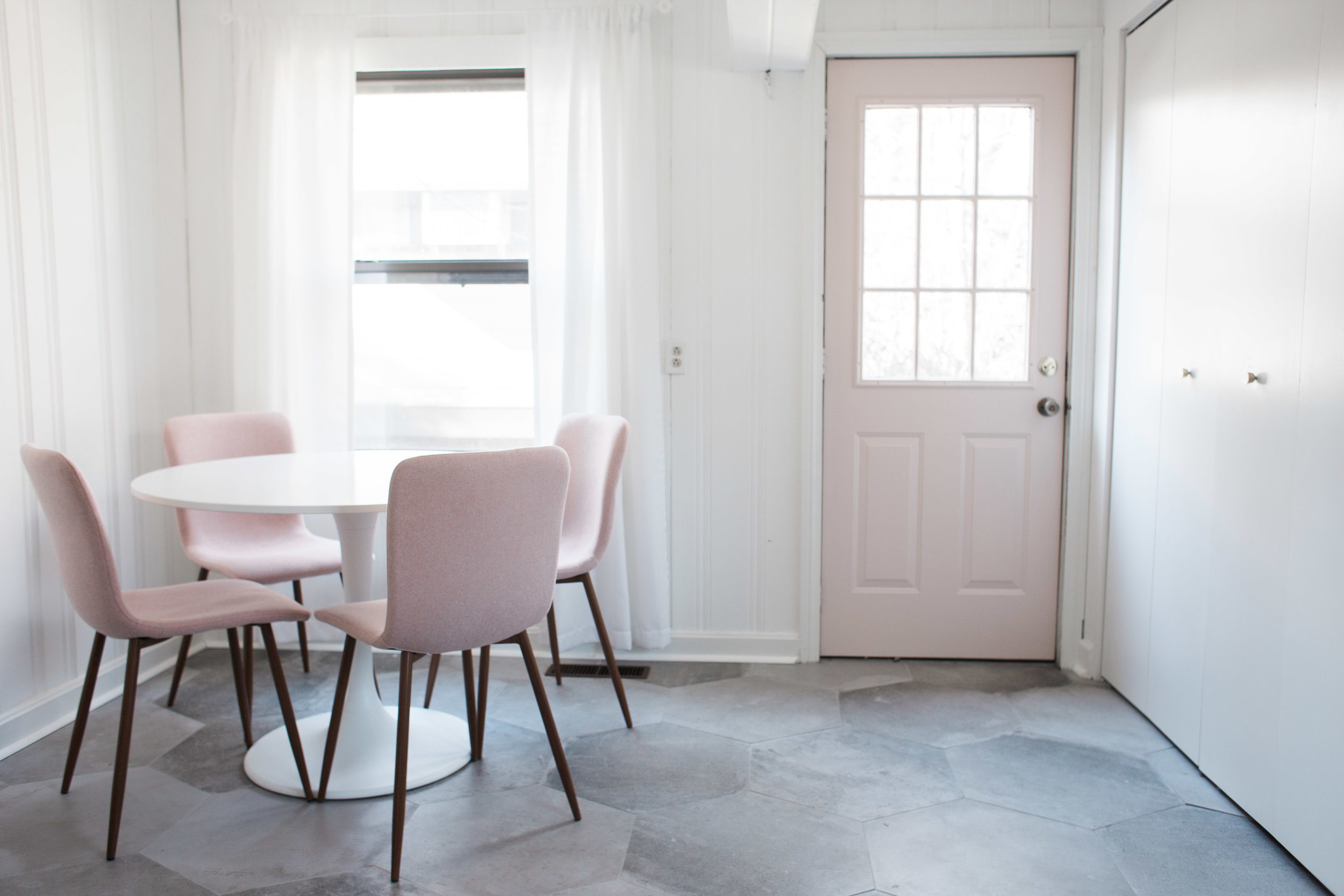
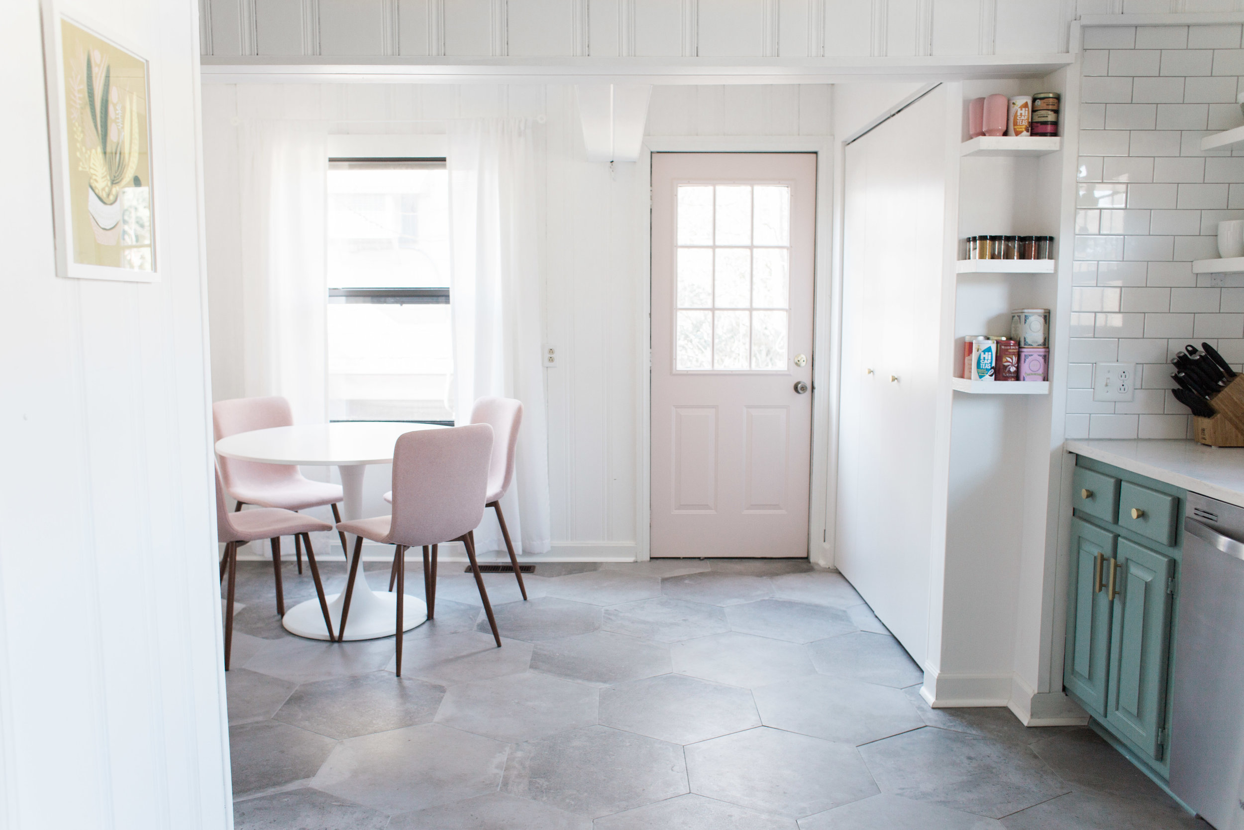
To brighten up the dark wood paneling, we painted the walls, trim, and ceiling in a crisp white, Benjamin Moore Chantilly Lace OC-65. It is incredible how a fresh coat of paint can make such a big impact!